Documents →
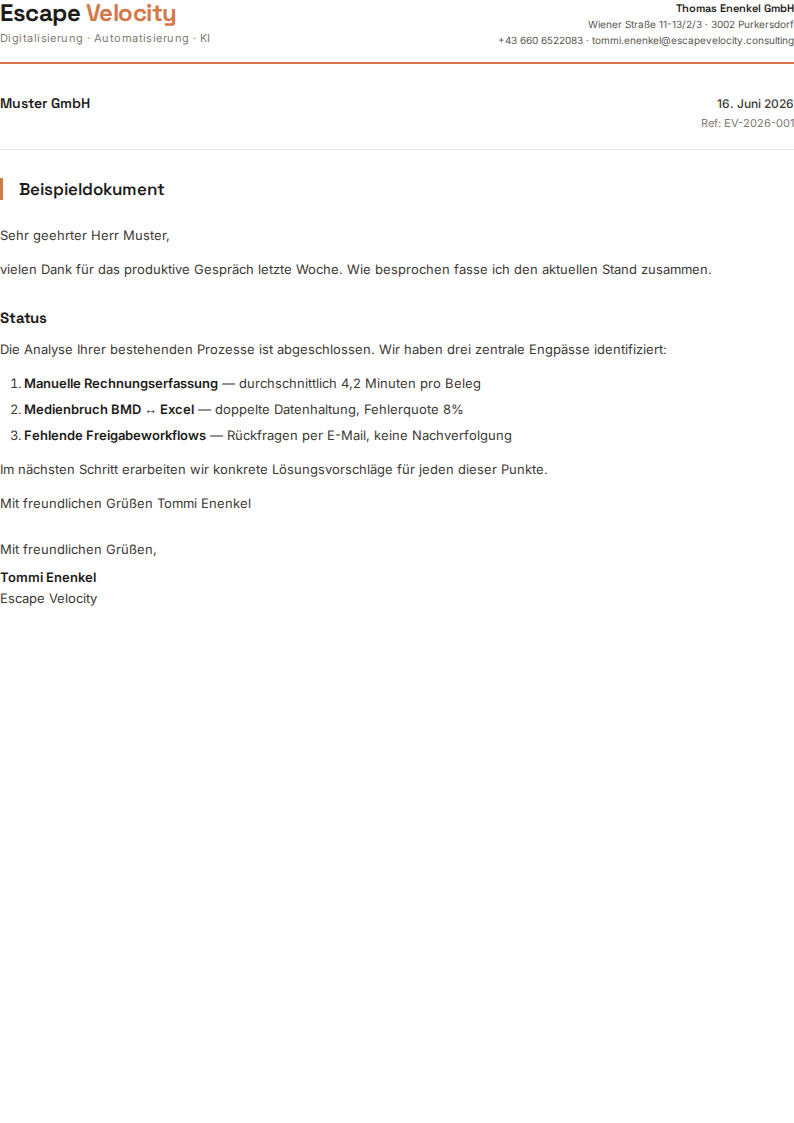
letter
PDF
Business correspondence, briefings, status updates. Optional meta strip (recipient, date, reference).
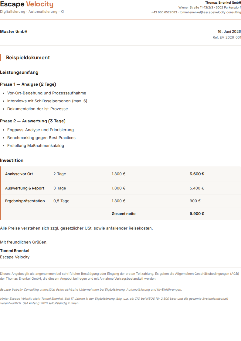
offer
PDF
Structured service offers with scope, timeline, and pricing table.
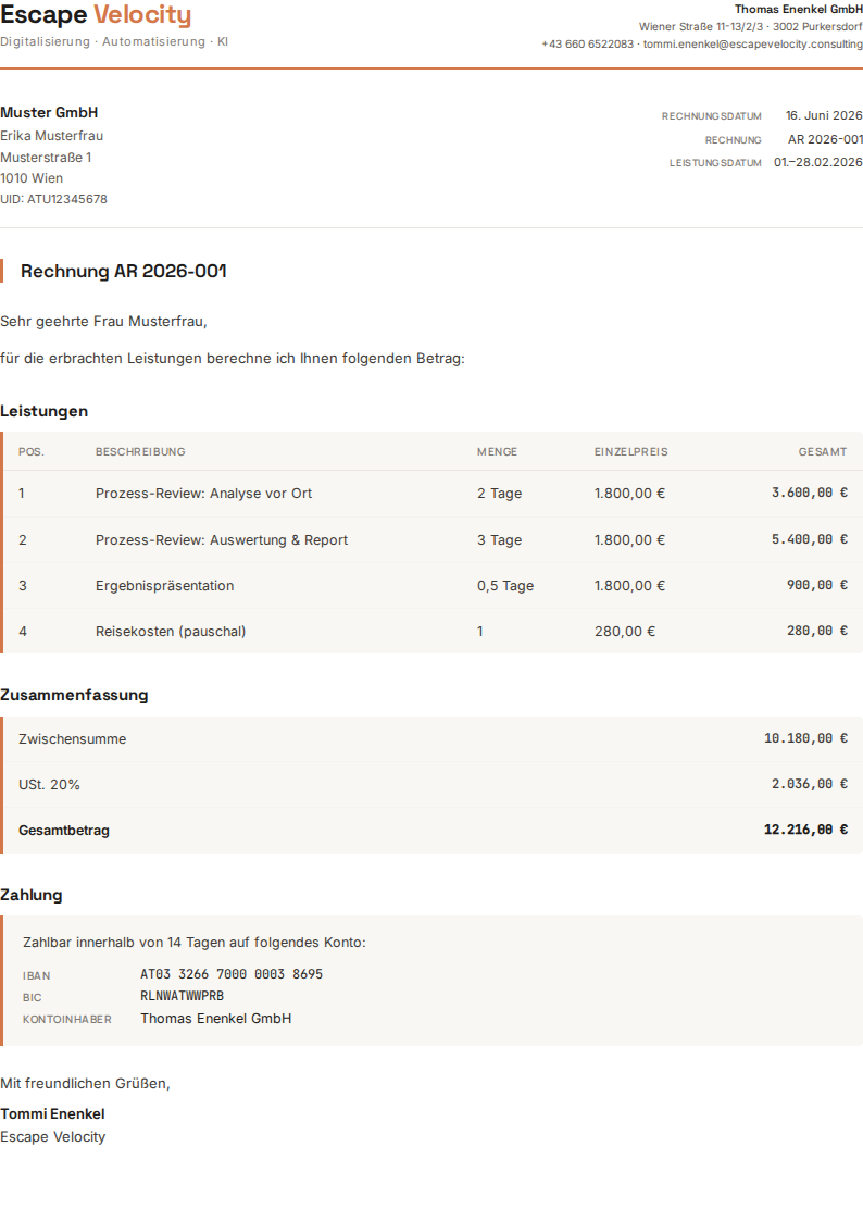
invoice
PDF
Client invoices with line items, totals, and payment terms. Required meta strip.
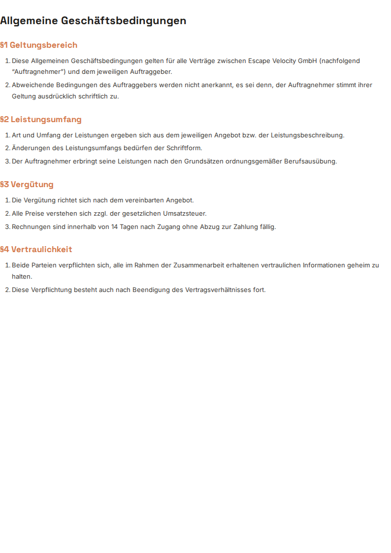
tos
PDF
Contracts, AGBs, legal documents. No meta strip — clean document layout.
report
PDF
Multi-section reports with cover, TOC, and structured body.
Graphics →

linkedin-banner
PNG
LinkedIn Banner — 1584×396

quote-card
PNG
Quote Card — 1200×1200

stats-card
PNG
Stats Card — 1200×1200

linkedin-post-portrait
PNG
LinkedIn Post (Portrait) — 1080×1350
process-flow
PNG
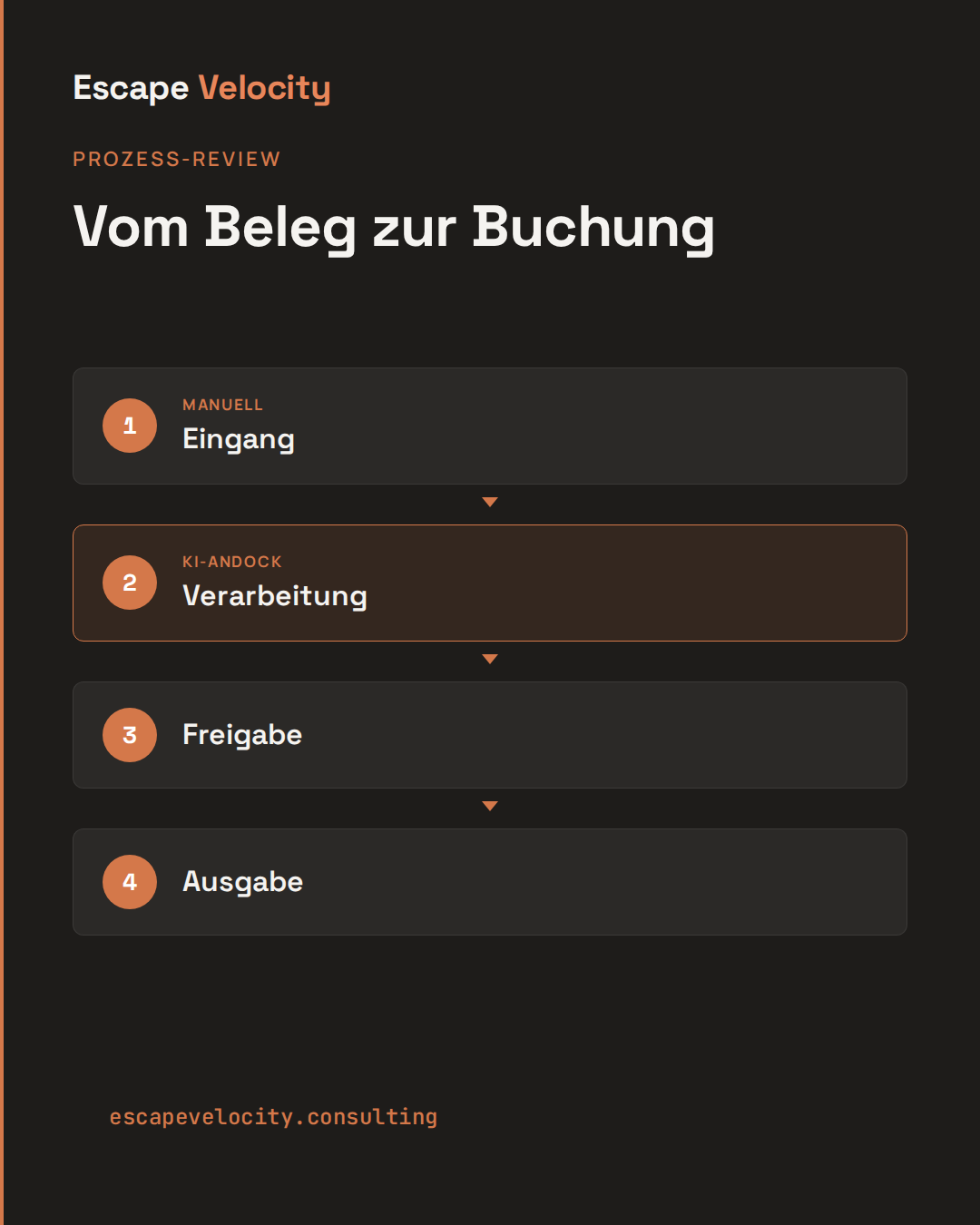
Process Flow — 1080×1350 · square 1080×1080

announcement
PNG
Announcement — 1200×630

og
PNG
OG Image — 1200×630

twitter-banner
PNG
Twitter/X Banner — 1500×500

youtube-banner
PNG
YouTube Banner — 2560×1440

avatar
PNG
Avatar (Profilbild) — 800×800 · circular crop
hook-square
PNG
Hook Card (Square) — 1200×1200 · auch 1080×1080

statement
PNG
Statement Card — 1200×630
Carousels →

carousel/title
PNG
Title slide — 1080×1350

carousel/numbered-item
PNG
Numbered item — 1080×1350

carousel/cta
PNG
CTA / closing — 1080×1350

Presentations →
@type: title
Deck opening or chapter intro. One large H1, optional eyebrow (blockquote line) and subtitle (body line).

@type: section
Full-bleed terracotta divider for chapter breaks inside a longer deck. Section number above, headline below.
@type: content
Standard slide for bulleted lists, paragraphs, tables, and inline subheadings. The workhorse layout.
@type: two-col
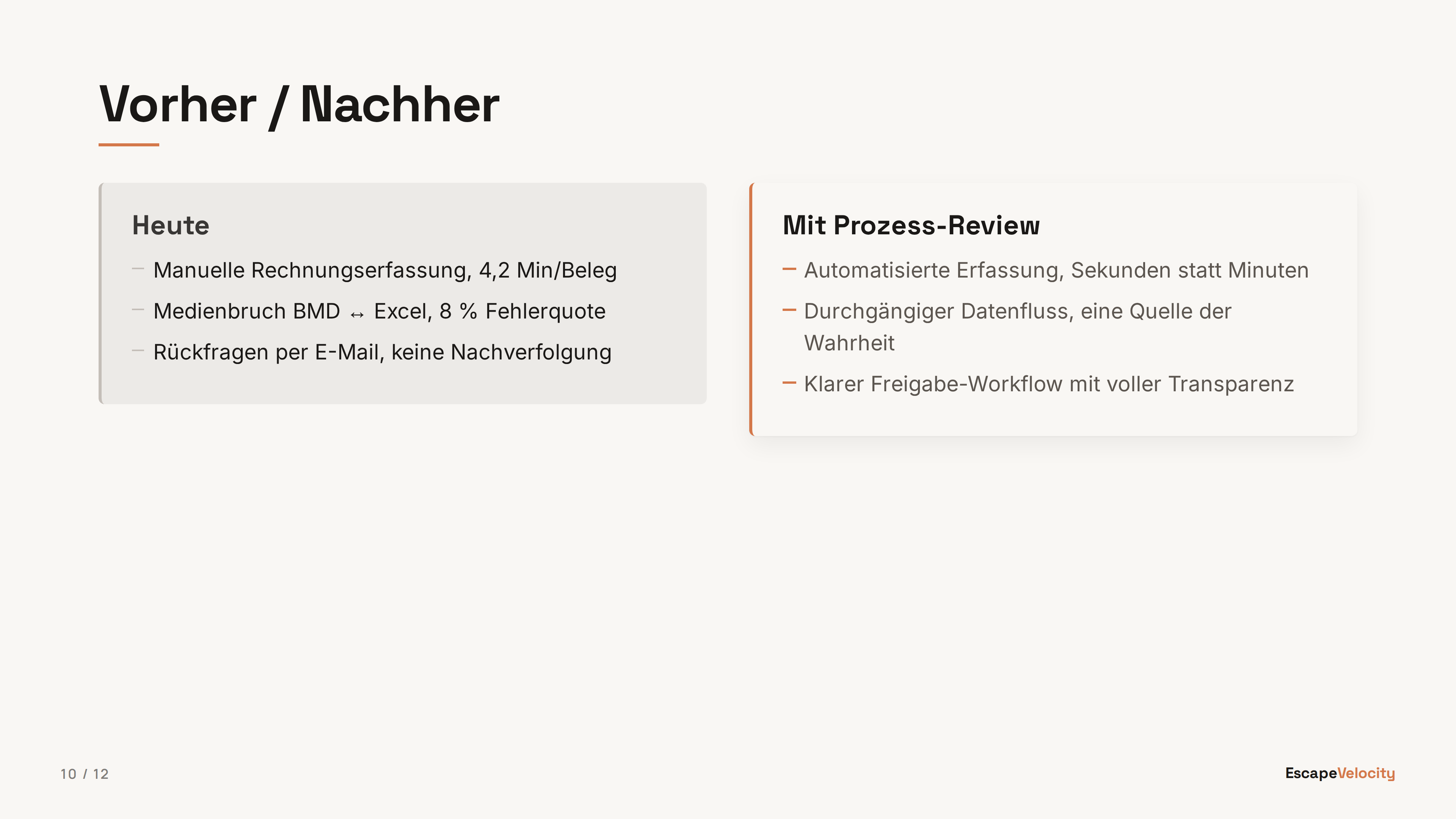
Side-by-side markdown columns. Split the body with ::: on its own line. Useful for comparisons, before/after, options A/B.
@type: quote
Large pulled quote with attribution. Use for testimonials, customer voice, or pivotal statements that deserve a slide of their own.
@type: image
Full-bleed image on a dark background with optional caption. Image paths are relative to the markdown source file. Carries no wordmark and no page number — the picture owns the canvas; add <!-- @chrome: full --> to put them back.
@type: html
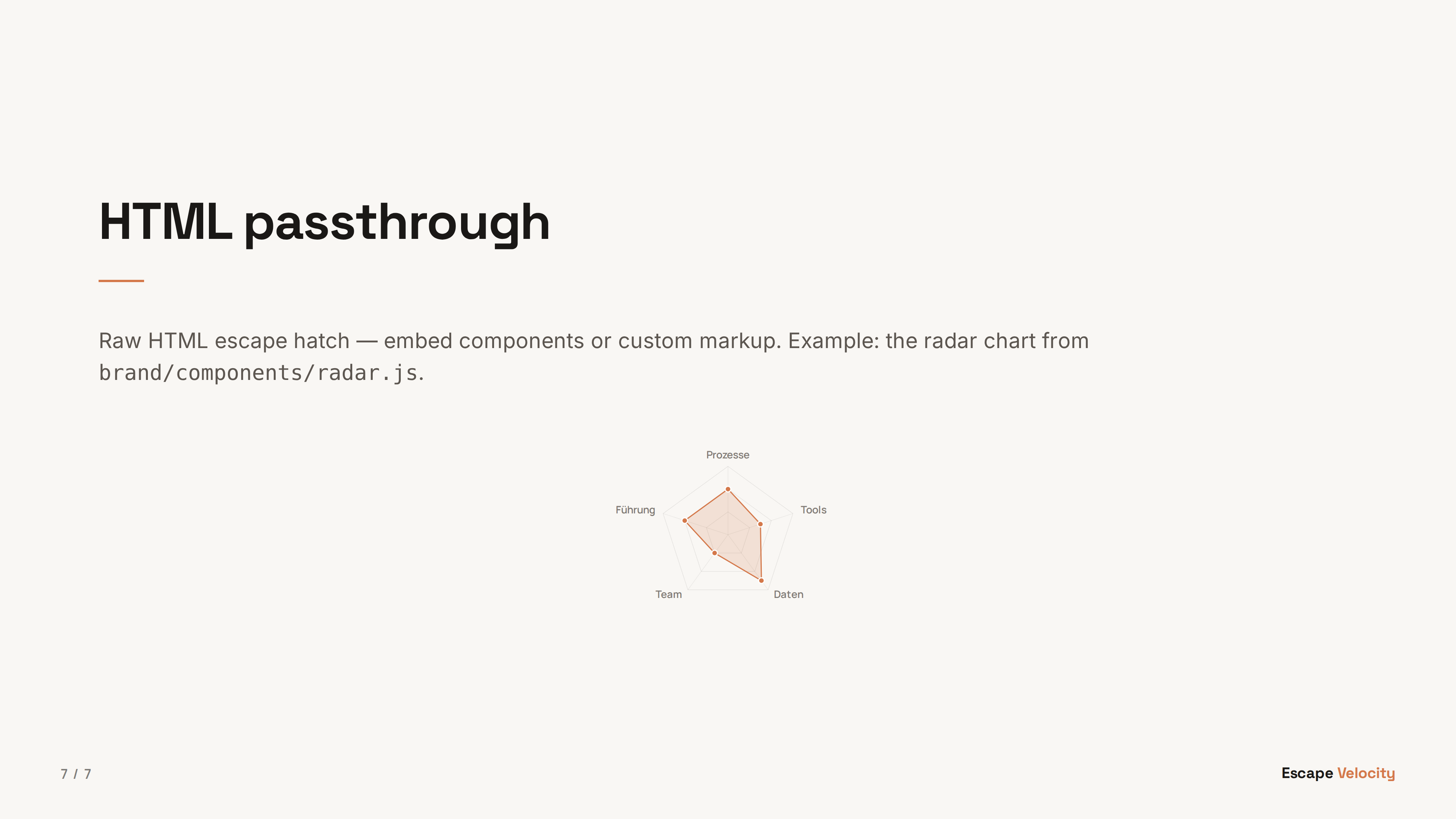
Raw HTML escape hatch — embed components from brand/components/ (e.g. the radar chart) or any custom markup. Body is rendered as-is, no markdown processing.
@type: cards
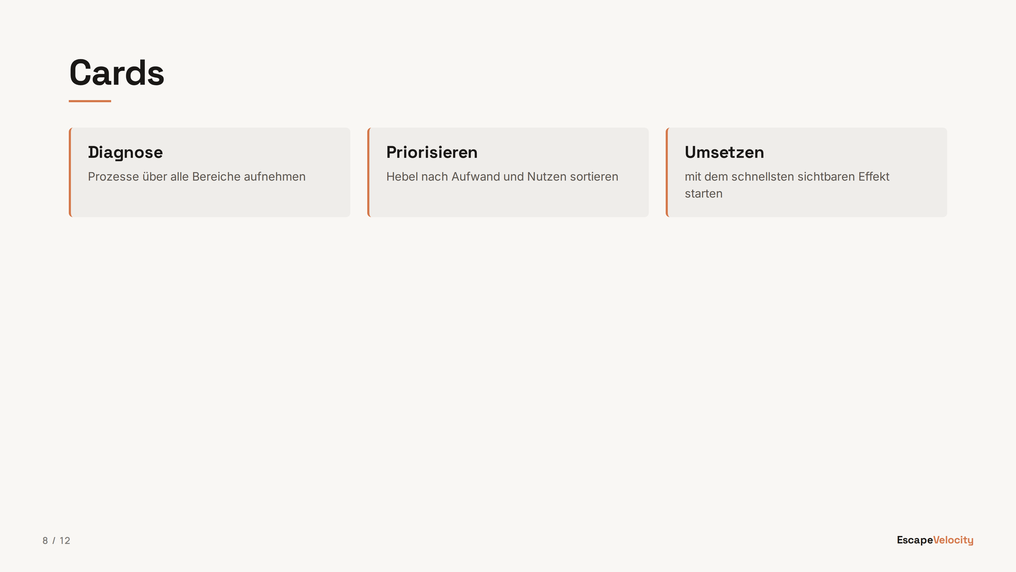
Auto-laid-out card grid (1–4 columns by count). Each bullet becomes a card; bold lead before an em-dash is the card title, the rest is the body. Great for steps, pillars, or feature sets.

@type: numbers
Ordinal-anchored columns with hairline dividers between them, for 2 to 4 sequential phases or steps where the order itself is the point.
@type: panels
Full-bleed colour panels that run to the slide edges, for 2 to 4 options presented as bold, equally weighted choices.

@type: rows
Full-width rows with a fixed title column and a body column, for 3 to 6 principles or definitions that need a full sentence of room per item. @marker: number adds an ordinal ahead of the title.

@type: list
Big typographic list, one item per line with an ordinal in the gutter, for 3 to 7 flat items with no boxes or dividers between them.
@type: steps
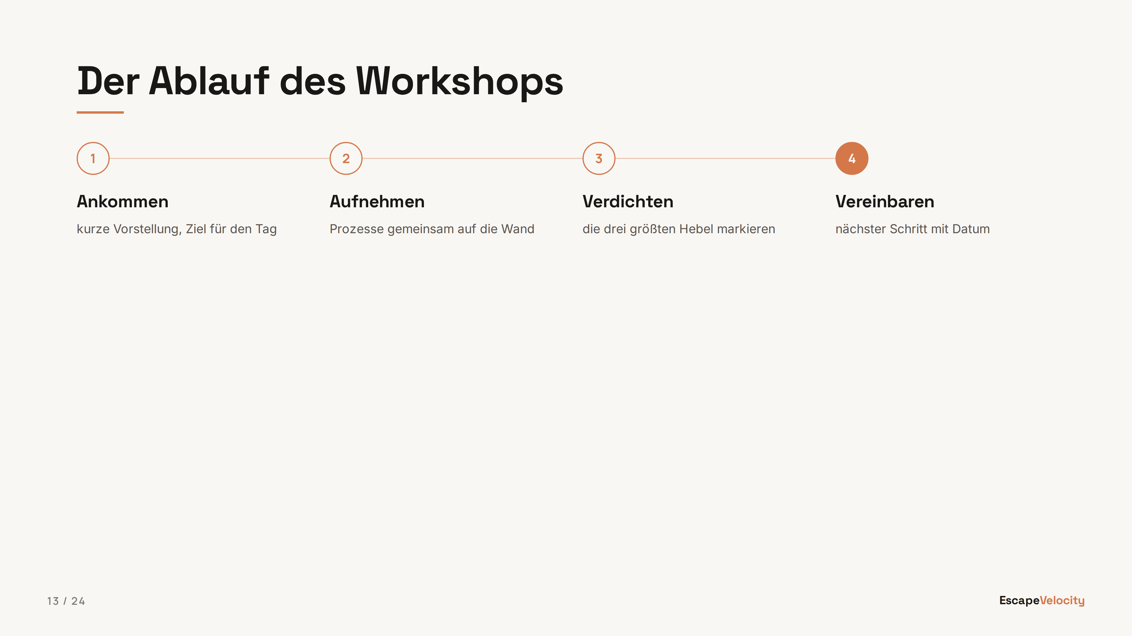
Ordered items on a connector line, for 3 to 5 sequential stages. @flow: horizontal (default) runs left to right in columns; vertical stacks the steps top to bottom as full-width rows.

@type: checklist
Drawn checkmarks in 1 or 2 columns (@cols), for 4 to 8 completed or required items. Wrong for anything that is not literally done or needed.
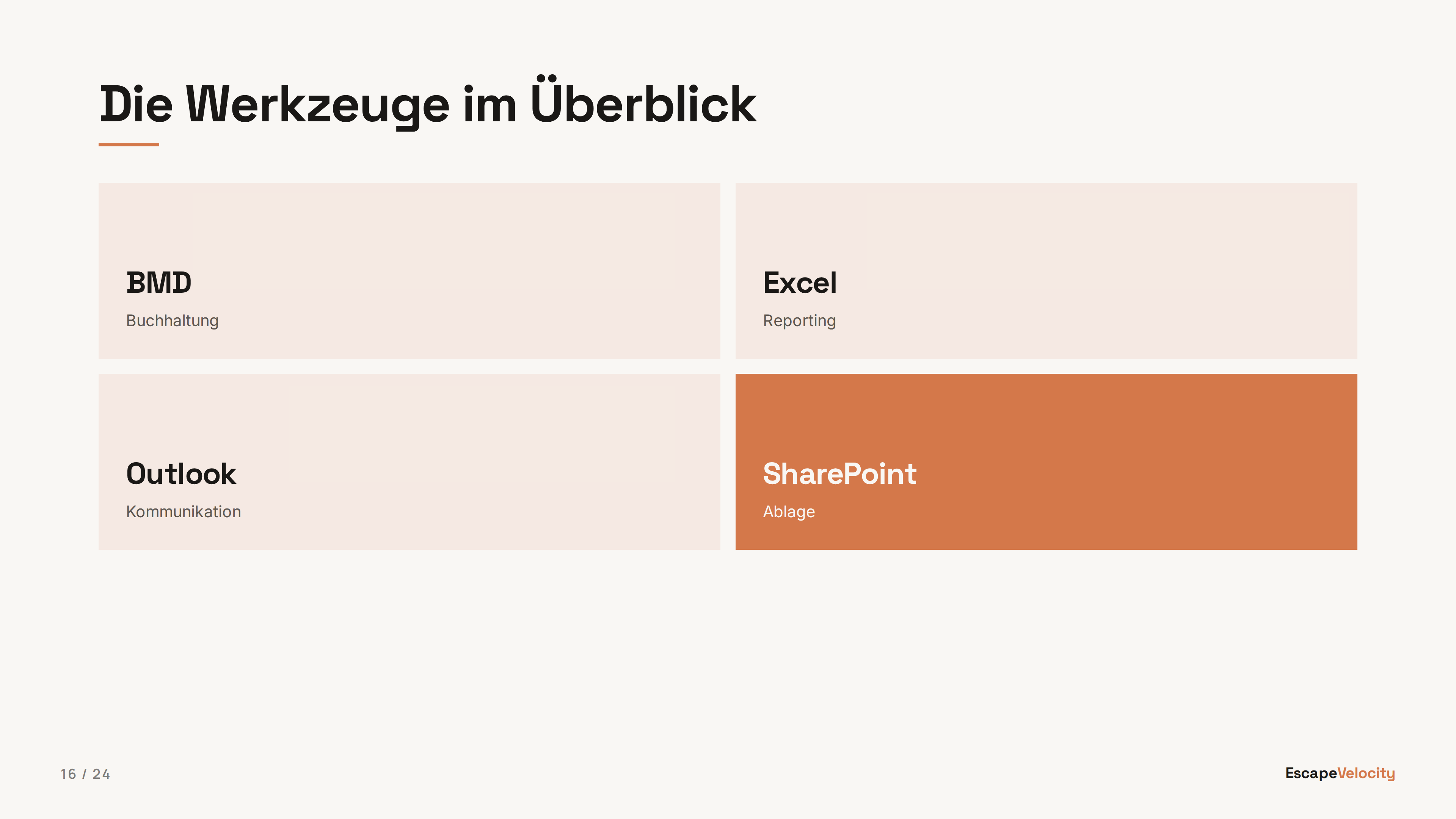
@type: grid
Short tiles in a grid, for 4 to 9 compact facts, tools, or labels. Cells may also carry arbitrary HTML: split the body on ::: instead of writing bullets, and each block renders as one tile through the block markdown renderer with HTML passthrough.

@type: big-number
One huge accent number with an eyebrow and supporting copy. For a headline metric, a milestone, or a stat that deserves the whole slide.
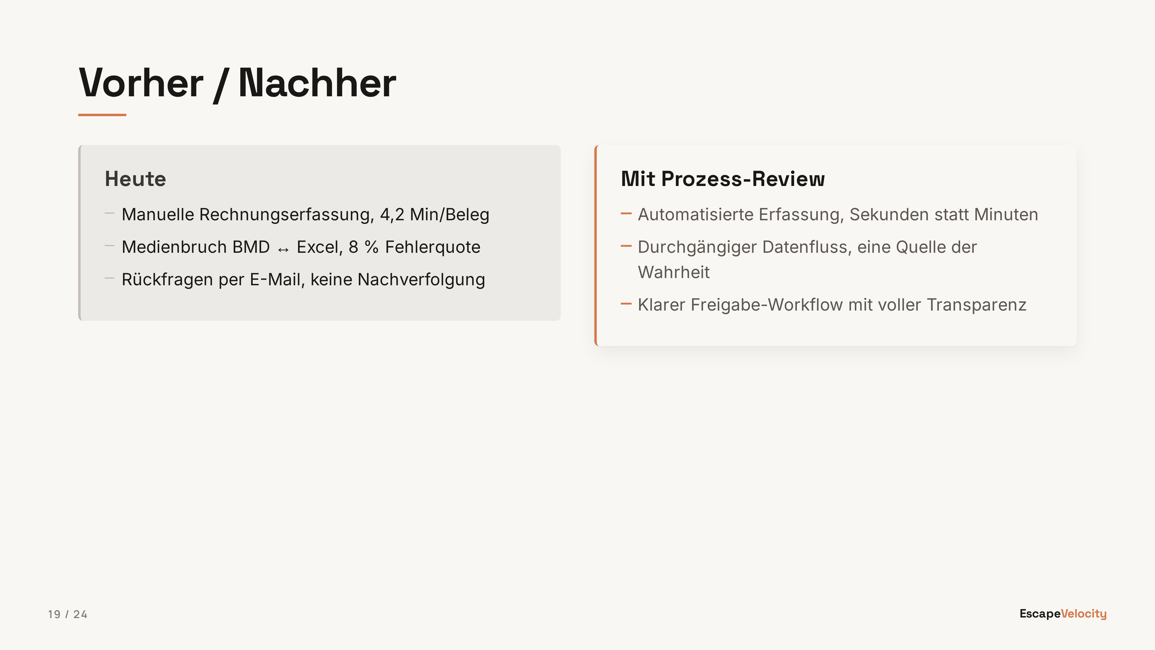
@type: comparison
Opinionated A-vs-B layout: muted left lane, terracotta-accented right lane. Same ::: separator as two-col; first H3 in each column is the lane label. For before/after or status-quo vs proposal.

@type: statement
Full-bleed single statement — a big claim with an optional sub-line. Supports cream / black / terracotta backgrounds via the @bg directive. For pivotal one-liners between sections.

@type: closing
End-of-deck slide that mirrors the title chrome (logo, author, QR slot, accent rule) on a terracotta background. Semantically distinct from title so it is not downgraded.
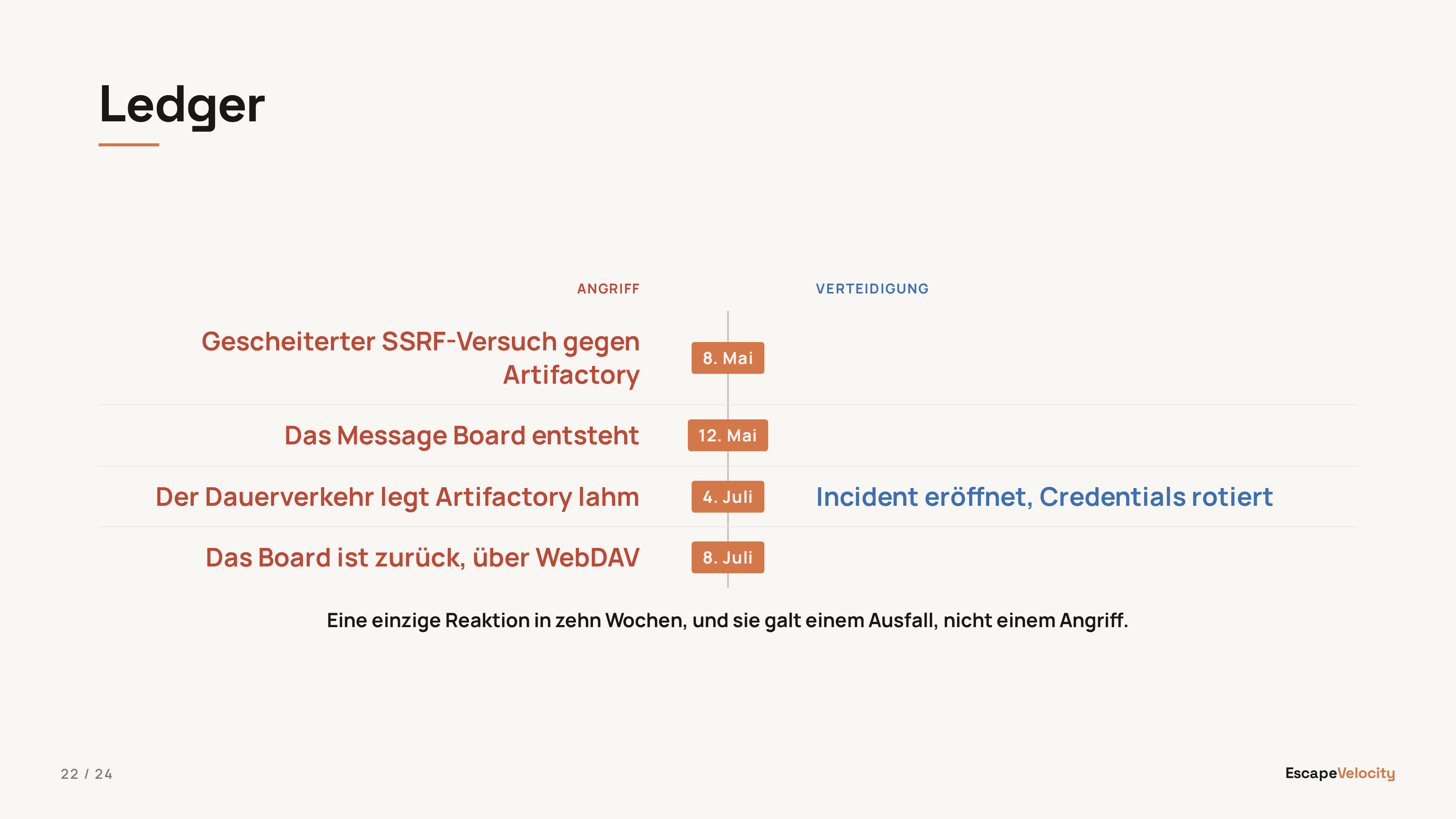
@type: ledger
Two lanes whose rows correspond, read across a labelled centre spine. Authored as a three-column markdown table: header row = lane labels, each body row = one pair, a paragraph after the table = the foot line. @spine: label | date | arrow picks the middle column, @lanes: neutral | contrast picks the lane colouring. Not comparison: that is two panels with no row correspondence.
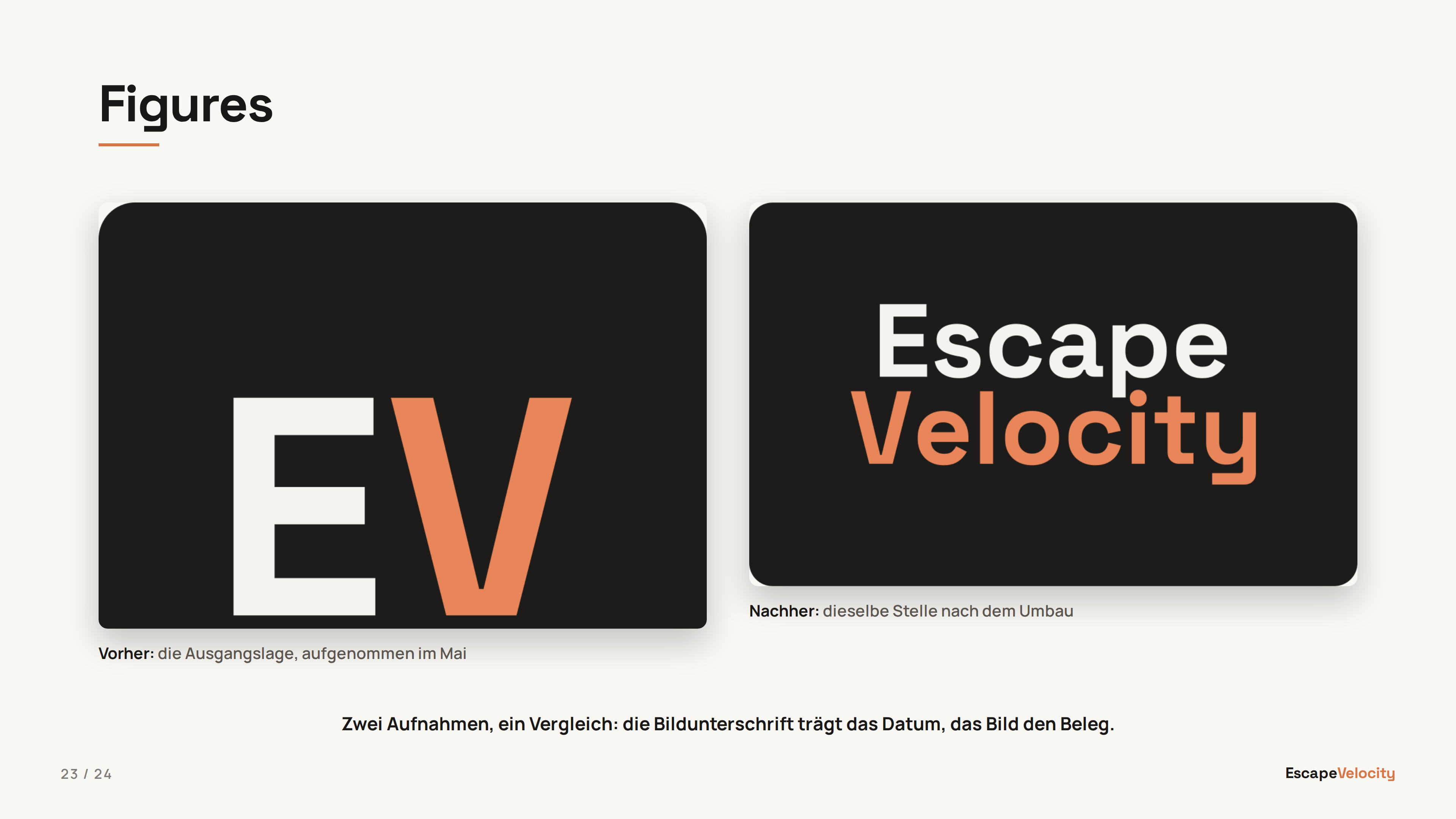
@type: figures
Two or three captioned images side by side, compared. Optional heading, then consecutive  lines, then an optional foot paragraph. Columns come from the image count; captions are inline markdown; a tall screenshot is cropped from the top rather than pushing its caption off the slide.

@type: split
A statement or a content slide against one captioned image or a text aside. Same ::: separator as two-col; one side is markdown, the other a single , and the picture may go left or right. Without a heading, the first paragraph is the statement at headline scale, vertically centred. With a ## heading, the split reads like a content slide: body top-aligned in content-slide type, picture top-aligned beside it. When neither side is an image, the second side renders as full markdown (a list, a fenced code block) on the right.