Presentations

Slide Deck Templates

The presentation generator renders Markdown into a self-contained HTML viewer, a PDF, and per-slide PNGs. Each slide picks a layout via an HTML-comment directive (<!-- @type: title -->). Slide thumbnails below are auto-regenerated from the canonical showcase deck whenever you run npm run build:assets — so this page always reflects the current state of the template.

npm run pres -- previews/decks/my-deck.md -o previews/decks/my-deck --pdf --png
Title slide thumbnail

Title slide @type: title

Deck opening or chapter intro. One large H1, optional eyebrow (blockquote line) and subtitle (body line).

<!-- @type: title -->
> Eyebrow text
# Headline
Optional subtitle line.
View in showcase deck →
Section divider thumbnail

Section divider @type: section

Full-bleed terracotta divider for chapter breaks inside a longer deck. Section number above, headline below.

<!-- @type: section -->
> Teil 2
# Section name
View in showcase deck →
Content thumbnail

Content @type: content

Standard slide for bulleted lists, paragraphs, tables, and inline subheadings. The workhorse layout.

<!-- @type: content -->
## Slide heading
- Bullet one
- Bullet two
- Bullet three

### Subheading
More body text.
View in showcase deck →
Two-column thumbnail

Two-column @type: two-col

Side-by-side markdown columns. Split the body with ::: on its own line. Useful for comparisons, before/after, options A/B.

<!-- @type: two-col -->
## Heading

### Left

- Column A markdown

:::

### Right

- Column B markdown
View in showcase deck →
Quote thumbnail

Quote @type: quote

Large pulled quote with attribution. Use for testimonials, customer voice, or pivotal statements that deserve a slide of their own.

<!-- @type: quote -->
> "Short, weighty quote text."
— Source · Attribution
View in showcase deck →
Image thumbnail

Image @type: image

Full-bleed image on a dark background with optional caption. Image paths are relative to the markdown source file.

<!-- @type: image -->
![Caption text](./path/to/image.png)
View in showcase deck →
HTML passthrough thumbnail

HTML passthrough @type: html

Raw HTML escape hatch — embed components from brand/components/ (e.g. the radar chart) or any custom markup. Body is rendered as-is, no markdown processing.

<!-- @type: html -->
<h2>Custom heading</h2>
<div id="my-chart"></div>
<script>
  document.getElementById('my-chart').innerHTML = renderRadarChart([4, 3, 5, 2, 4]);
</script>
View in showcase deck →

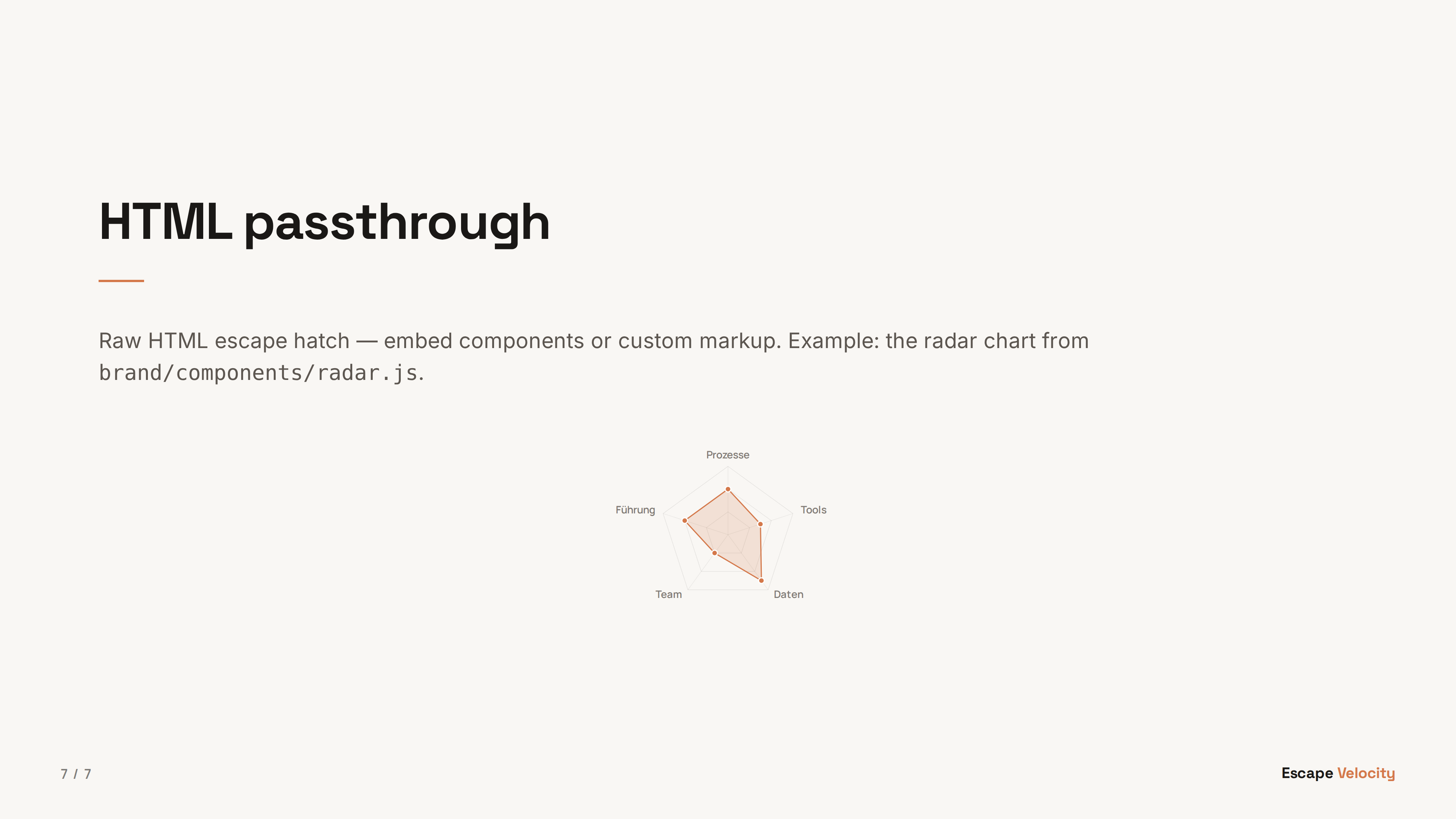
HTML passthrough + components

The @type: html slide hands the body to the viewer unchanged, so you can embed components from brand/components/. The canonical example is the radar chart on slide 7 of the showcase — a portable copy of the same chart used on the website quiz.

Component files live in brand/components/*.js and are auto-copied into each deck's output directory so the viewer can load them via <script src="components/radar.js"></script>.

Source: previews/showcase/slide-types.md. Regenerate thumbnails with npm run build:assets.